30 Years of Ecommerce: Our History of Selling Computers Online
8th May 2026
When we launched our business three decades ago, the term "e-commerce" didn’t even exist. The internet was still an emerging landscape, and the idea of buying and selling goods online was a novelty that few could imagine would become the backbone of global commerce. Bob has told some of us in the office stories about taking a trip to the barber shop during the day and telling the barber he sells computer parts online. The typical response was “You can do that?”
We started out before social media and even before most people had broadband internet. Our first customers were early adopters who found us through word of mouth, niche forums, or simple search engines. The challenges were huge. We had to convince people to trust our website enough to mail in their payments, and Bob learned HTML from scratch to build our first few sites. We fulfilled orders using just a spreadsheet and a pile of shipping labels. Looking back on our 30-year journey, we’re proud to have been pioneers in a field that would go on to change the world.
What is e-commerce? E-commerce, short for electronic commerce, is the buying and selling of goods or services using the internet, and the transfer of money and data to execute these transactions. Today, e-commerce encompasses everything from giant online marketplaces to small boutique shops, integrating mobile apps, social media, and advanced logistics. But back when we started, the idea of e-commerce wasn’t just a buzzword—it was a brand new concept. There were no templates, no established best practices, and very little legal or financial infrastructure for online sales. Our early operations helped define what e-commerce would become—innovative, ever-evolving, and customer-focused. We learned to adapt quickly, shaping our business as the digital world itself was being built.
The Early Days: Before Credit Cards Online
Back in the mid-90s, the internet was more of a digital Wild West. Security protocols were minimal, and online credit card payments weren’t yet a reality. Every order was a leap of faith on both sides—our founder, Bob, would check the PO box for money orders, sometimes sent from halfway across the country, and wait for payment to clear before shipping anything. There were no payment processors or automated checkout carts; instead, orders arrived via email or even through printed order forms that customers mailed in. It was a system built on trust and patience, both from us and our customers. We kept meticulous records, communicated closely with buyers, and learned to anticipate the unexpected in those early days.
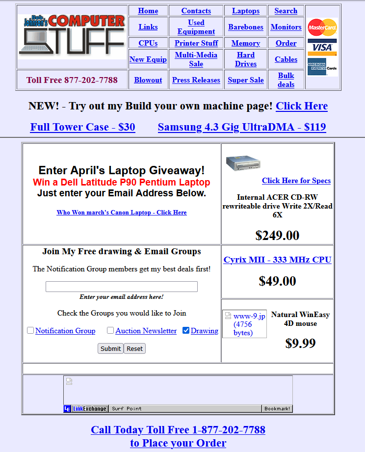
Website Design (1998): Our earliest website was simple—just a handful of pages with basic product listings, contact information, and a mailing address. The design was utilitarian, with default HTML backgrounds, blue hyperlinks, and pixelated logos. Looking back at screenshots from this era, the nostalgia is real: table-based layouts, Times New Roman, and the unmistakable look of early web browsers. The simplicity was part necessity, part charm—every image was carefully compressed to load quickly over dial-up connections, and navigation was straightforward, guiding customers through our modest catalog.
The turn of the millennium brought profound changes. As the internet matured, so did the tools for online business. Secure payment gateways finally enabled customers to use credit cards safely, and online shopping became more accessible to the average consumer. This innovation revolutionized how we operated, allowing for faster order processing and greater reach. We expanded our product offerings, streamlined our fulfillment process, and began to experiment with online advertising. The excitement of the dot-com era was palpable as new opportunities and challenges emerged almost daily.
Implementing One of the First Online Shopping Carts (2002)
One of our proudest technical milestones came at the dawn of the 2000s, when we launched one of the earliest online shopping cart systems in our industry. At the time, most websites still relied on email orders or basic forms, but we saw the potential to make shopping easier and safer for our customers.
The cart wasn’t just a technical upgrade—it transformed the way people interacted with our store. Suddenly, customers could browse at their own pace, build up their order, and complete a purchase in one seamless flow. As secure payment gateways became available, we integrated the cart with our new credit card processor, opening the door to a whole new era of online convenience.
Looking back, this early cart system set us apart from the competition and established our reputation for innovation. It was a leap of faith that paid off, paving the way for the advanced, user-friendly ecommerce experiences our customers enjoy today.
The Panasonic Toughbook Chapter (2006)
Bob’s foray into selling Panasonic Toughbooks marked a turning point for our business. Around 2006, recognizing a growing demand for rugged, reliable laptops—especially among field workers, emergency responders, and industries that needed technology to withstand tough conditions—Bob began sourcing and refurbishing Panasonic Toughbooks. These laptops quickly became a cornerstone of our inventory and set us apart from traditional electronics resellers.
As word spread about our commitment to quality refurbishment and customer support, we became one of the primary refurbished resellers of Panasonic Toughbooks in the country. Our expertise in testing, restoring, and customizing these rugged laptops drew a loyal customer base from across the U.S. and beyond. The Toughbook line required us to develop specialized knowledge and offer tailored solutions, from custom imaging to unique accessory bundles. This era not only solidified our reputation for reliability but also demonstrated our ability to adapt and lead in niche markets within the broader ecommerce landscape.
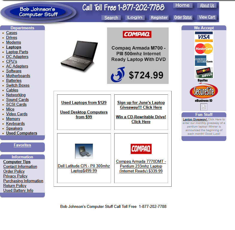
Website Design (2006): Our site evolved to include more vibrant colors, animated GIFs, and a new logo. The navigation improved, and we experimented with Flash banners (a sign of the times!). Product images became more prominent, and we started featuring special promotions on our homepage. Yet, by today’s standards, these designs look charmingly dated, with busy backgrounds and clunky navigation bars. Looking back at our screenshots from these years, you’ll see experiments with frames, pop-up windows, and the occasional splash page—a testament to the creativity and chaos of the era.
Web 2.0 and the Rise of User Experience
The next major shift was the focus on user experience. As Web 2.0 technologies took over, our customers expected sites that were not only functional but also inviting and easy to use. We revamped our website to be cleaner, more intuitive, and mobile-friendly. Shopping carts became smarter, search functions improved, and we began offering personalized recommendations. Social media integration and customer reviews became the norm, helping us build a loyal community around our brand. We also started sending newsletters, holding online promotions, and interacting with customers through emerging platforms like Facebook and Twitter.
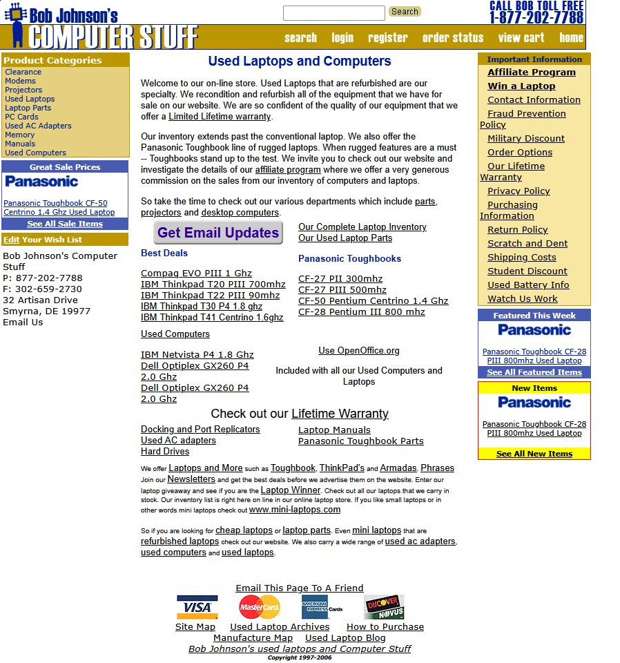
Website Design (2012): Screenshots from this period show a move toward minimalist layouts, clear calls to action, and the first hints of responsive design. We prioritized fast load times and an easy checkout flow, using whitespace and refined typography to create a modern look. Our logo got a facelift, and we adopted a color palette that still feels fresh today. You’ll notice in our screenshots the increased use of icons, seasonal sales banners, and mobile layouts that make browsing easy.
Fun Website Themes and Legendary Pranks
Our most memorable theme remains the infamous 2014 April Fool’s Day prank. That year, unsuspecting visitors to our website were greeted by a bold headline: “Under New Ownership.” For one glorious day, the site homepage was transformed to make it seem like we got bought out by a hot sauce review company, “Eat More Hot Sauce Reviews.”
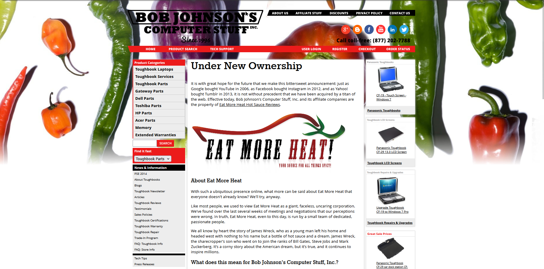
For the record: No, Bob Johnson’s Computer Stuff did not get bought out by Eat More Hot Sauce Reviews in 2014. That was just our way of keeping things playful, connecting with our customers, and proving that e-commerce can have a sense of humor. Many longtime fans still mention that April Fool’s prank when they talk to us, and it’s become a fun part of our company lore.
The Transition To BigCommerce
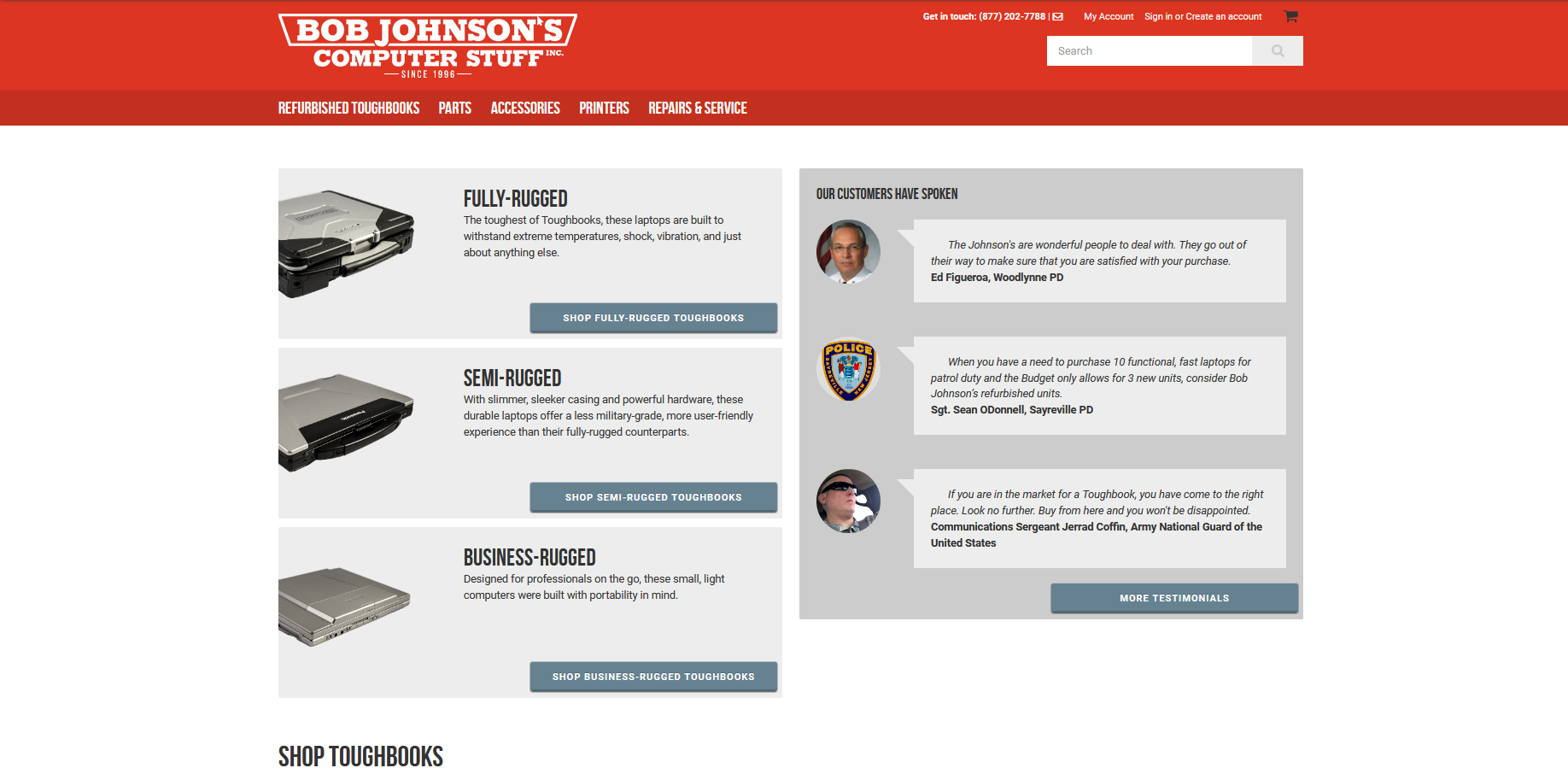 In 2015, we took another major leap forward by migrating our entire online store to the BigCommerce platform. BigCommerce gave us the flexibility and scalability we needed as our business and our Toughbook inventory continued to grow. The platform enabled us to streamline the shopping experience through better navigation, robust search, and more reliable inventory management. It made it easier for customers to find exactly what they needed, whether browsing from a desktop or their phone, and it gave us the tools to showcase our expertise and unique value as refurbished Toughbook specialists.
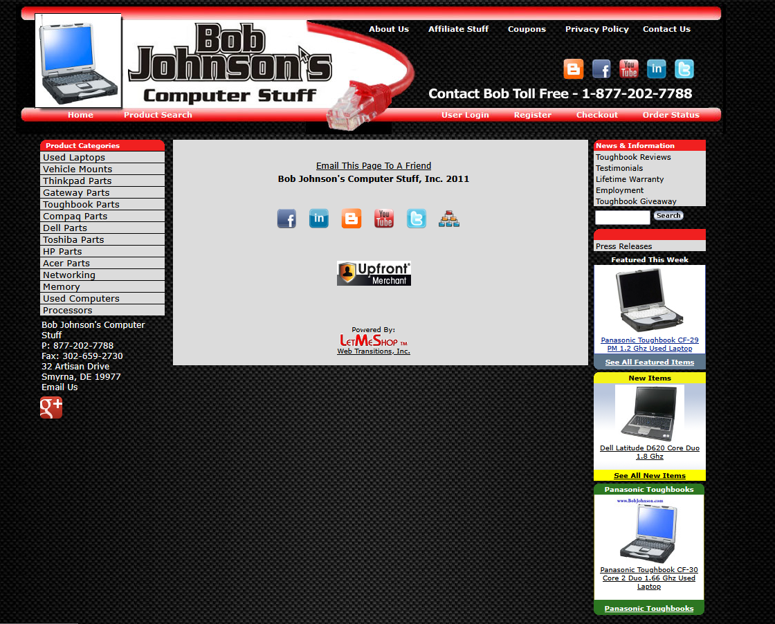
But perhaps the most significant change was the adoption of our now-iconic look and feel. Our branding became more cohesive and memorable, with bolder colors and a modernized logo that reflected our rugged, tech-savvy personality. Every page was crafted to be as user-friendly as possible, with easy-to-read fonts, clear calls to action, and product images that really popped.
The homepage prominently features our refreshed logo at the top, set against a background of deep blues and metallic grays that evoke reliability and innovation. Main navigation is laid out across the top, with categories for Toughbooks, accessories, and support, making browsing intuitive. Below the header, a rotating banner showcases our latest deals and top-selling models, immediately drawing visitors’ attention.
Product images are crisp and neatly organized in a grid, each with clear pricing and “Add to Cart” buttons. The sidebar highlights customer testimonials and links to our blog—showing our commitment to transparency and community. The overall design feels professional, inviting, and distinctly “us”—a look that has become synonymous with Bob Johnson’s Computer Stuff ever since.
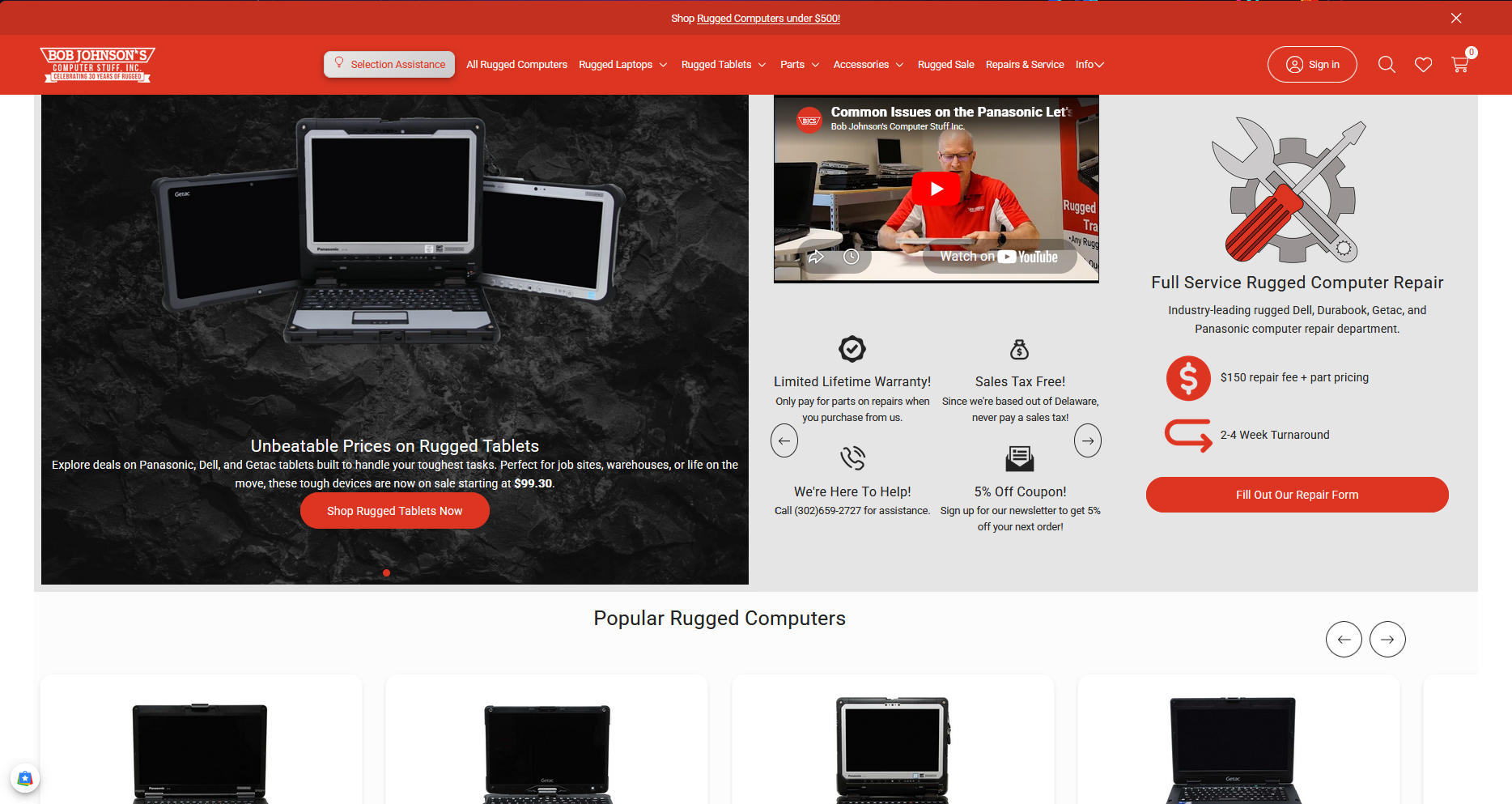
Building on the BigCommerce Foundation
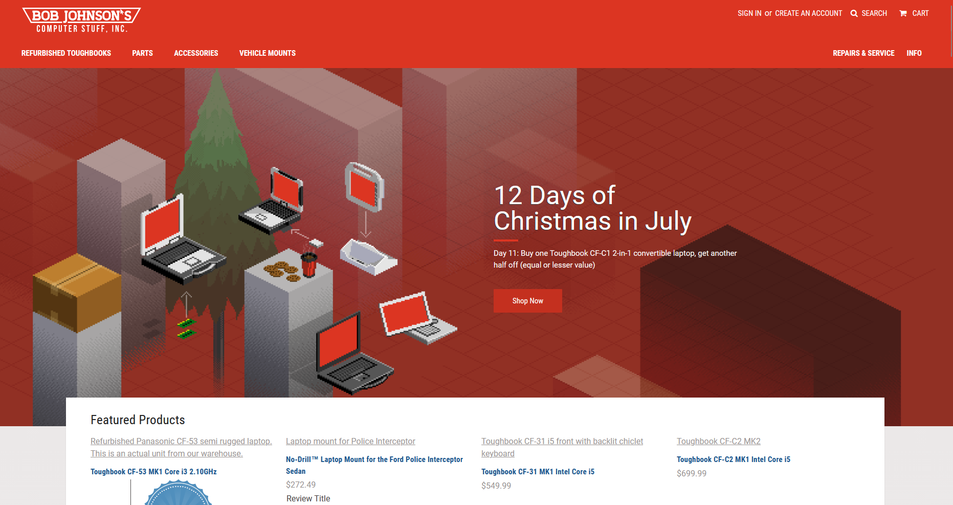
After our 2015 transition to BigCommerce, we made it a priority to keep building on the solid foundation that platform provided. Every improvement over the following years was made with our customers in mind—making the site more powerful, more helpful, and more distinctly “Bob Johnson’s Computer Stuff.”
The most striking example of this evolution is captured on our homepage with the big hero banner. This visual centerpiece spans the top of the site, showcasing bold, high-resolution imagery of the latest Toughbook models and key offers. The hero banner isn’t just decorative; it’s designed to immediately communicate our expertise and our focus on rugged technology solutions. With every update, we kept our color palette of deep blues and metallic grays, reinforcing a sense of reliability and innovation.
Navigation remained as intuitive as ever, but we enhanced it with dropdown menus and quick links to bestsellers, support resources, and special deals. We also refined the product grid beneath the hero banner, using larger images, clearer pricing, and dynamic “Add to Cart” buttons that respond instantly to user actions.
One subtle but meaningful addition was the rotating customer testimonial carousel just below the banner—real feedback from real buyers, which helped build even more trust with new visitors. Alongside this, links to our blog and support center made it easy for shoppers to get answers or learn more about their purchases.
This era of continuous improvement, anchored by the hero banner and our cohesive branding, helped us turn our website from a simple storefront into a destination—a place where customers could not only buy, but also learn, connect, and return again and again, knowing they’d get the same reliable experience every time.
Modern E-commerce: Innovation and Resilience (2025)
Today, e-commerce is more dynamic than ever. We leverage analytics, AI-driven recommendations, and seamless checkout experiences to serve customers around the world. Our inventory syncs in real time, and customers can track their orders from purchase to delivery. We’ve embraced new payment methods like Apple Pay and PayPal, offer live chat support, and continue to optimize our site for speed and security. Our site is a far cry from the early days—sleek, secure, and designed for a global audience. The journey from hand-coded HTML to today’s sophisticated platform is a testament to our commitment to innovation and resilience.
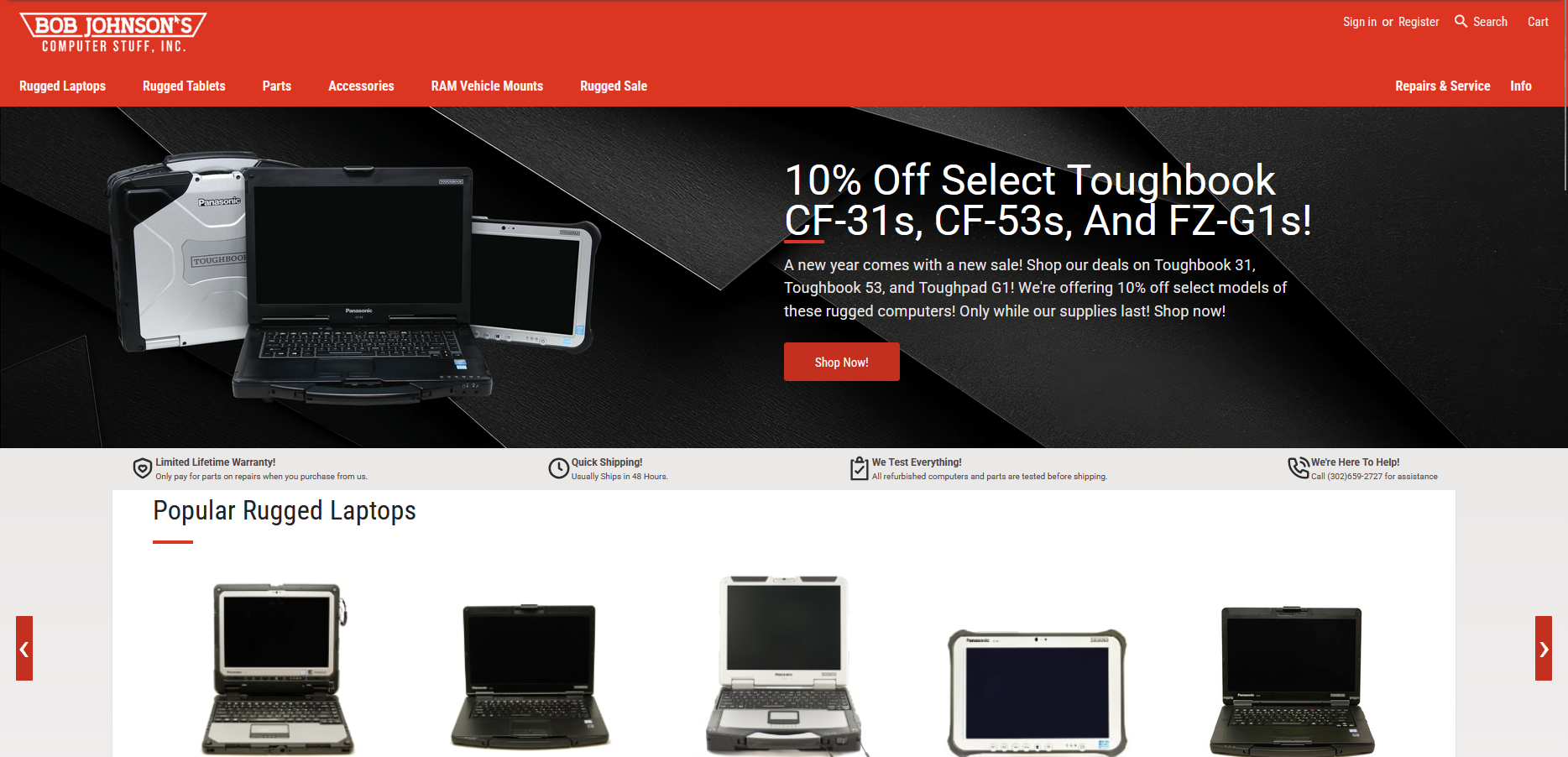
And last—and definitely not least—is the brand new website design we rolled out this year. This redesign is more than just a visual upgrade; it’s a complete reimagining of how we connect with our customers. We’ve streamlined navigation to make finding products faster and easier, introduced a cleaner and more modern look, and improved site speed across all devices. The new layout is fully responsive and ADA-compliant, ensuring accessibility for everyone. We’ve added new features, including expanded search, real-time chat for instant support, and interactive product galleries, so customers can see every detail before they buy. Our content is now easier to read, and our checkout process is the smoothest it’s ever been.
What truly excites us about this redesign is how it reflects our company’s commitment to innovation and customer service. We gathered feedback from longtime clients, tested new ideas, and worked with designers to create an experience that honors our history while setting a new standard for the future. This new look is not just a milestone—it’s a promise that we’ll keep improving for years to come.
Our current site embodies modern design principles: bold visuals, streamlined navigation, and accessibility features. We use high-resolution images, video demonstrations, and flexible layouts that look great on any device. Accessibility is a top priority, ensuring that everyone can shop with us. Each design iteration tells the story of our growth—not just as a business, but as a part of the digital revolution. Our screenshots from this era showcase a polished, professional look that reflects our decades of experience.
Looking Back and Moving Forward As we celebrate 30 years in ecommerce, we’re grateful for the trust our customers have placed in us and the lessons we’ve learned along the way. The screenshots of our website over the years are more than just digital artifacts—they’re milestones on a journey of adaptation, innovation, and resilience. Here’s to the next 30 years!